Dennis Hackethal’s Blog
My blog about philosophy, coding, and anything else that interests me.
New Landing Page and Navbar Design
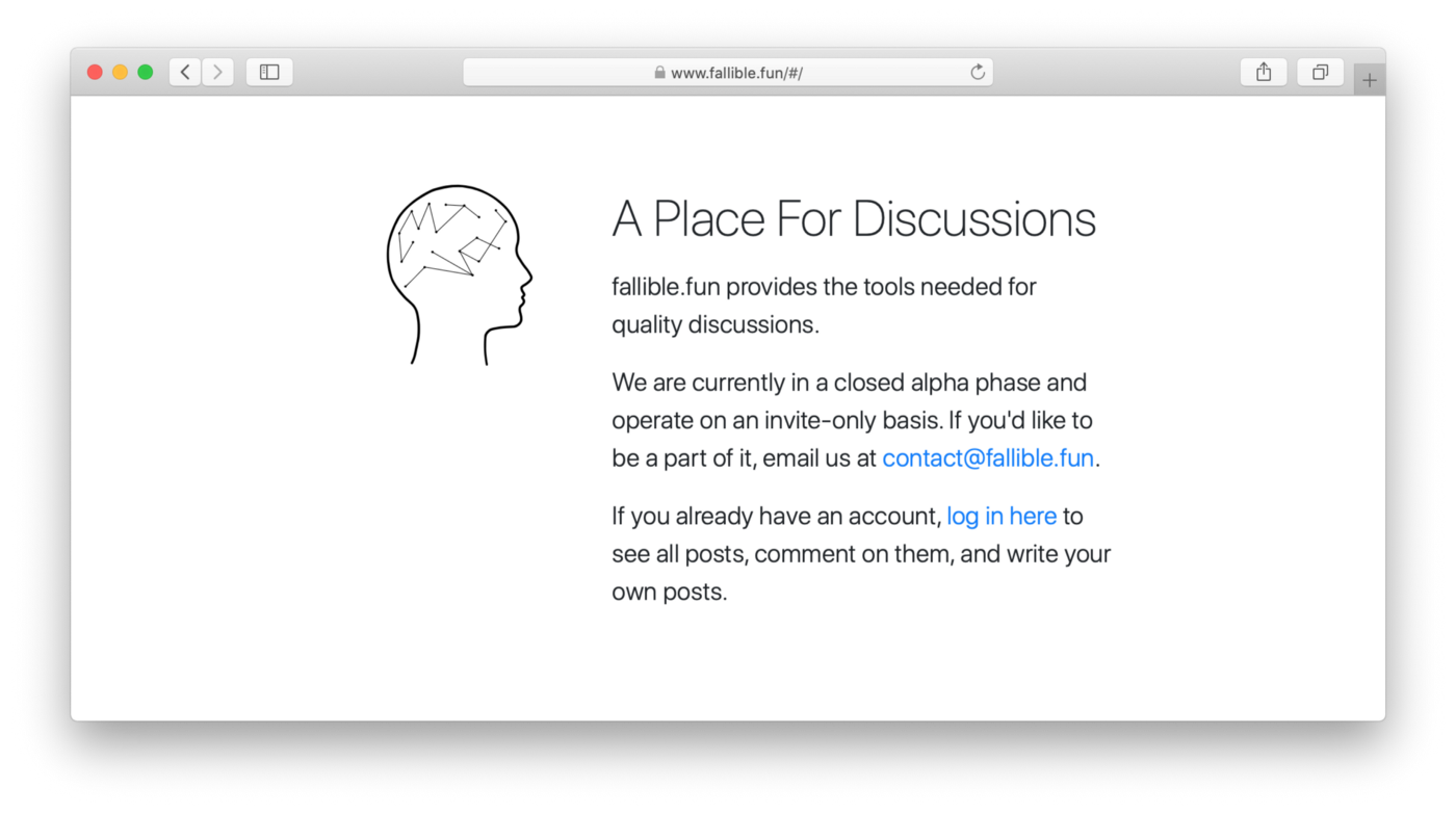
My sister designed a logo for fallible.fun and it looks awesome. It's featured on the new landing page:

How cool is that logo?
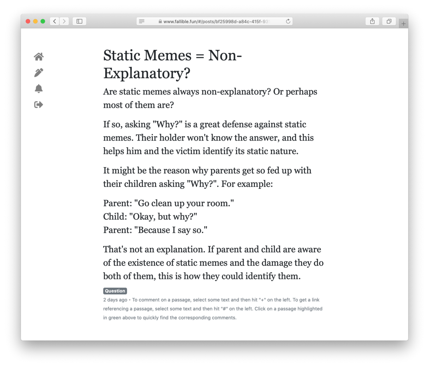
And I redesigned the navbar. It is now only visible on in the standard Bootstrap collapsed style on mobile, and on screens larger than mobile I replaced it with a sidebar. I wanted it to sort of visually disappear when you don't need it so you can focus on the post you're reading:

It's the sidebar on the left.
That's it. It's there if you need it, but otherwise it's just about you interacting with the text in front of you.
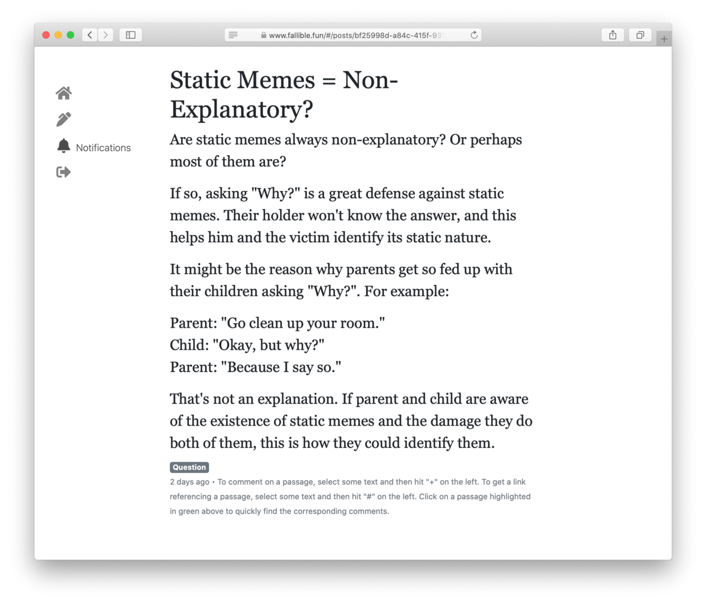
The text corresponding to each sidebar item appears when it corresponds to the current page, and as you over it:

You can't see the cursor there because it's a screenshot, but it's hovering over the notifications item in the sidebar. The same text appears without hovering when you are on the notifications page.
If you enjoyed this article, follow me on Twitter for more content like it.
What people are saying